ARLAS v27: Empowering Your Geospatial Data with Enhanced Visuals and Core Strength.
Many changes have taken place in ARLAS since the last update of ARLAS version 26 which introduced smoother dashboard setups and enhanced data dimension interactions. Now, with Version 27, we're taking it even further.
In version 27, we're not just pushing the boundaries of visualisation; we've also ramped up some core functionalities by updating Angular and transitioning from Mapbox to MapLibre. Our exciting new visualisation features include a COG Viewer with T-tiler, direct timeline-layer display, expanded color palette options for interpolations, and a new collection view within ARLAS-Hub. And while flat map projections excel for detailed geodata analytics, we've also introduced a stunning 'globe view' – with compelling technical reasons we'll delve into later in this article!
We’ll start with the front-end features you'll love interacting with. If you're building solutions that leverage geo big data, remember, you don't have to start from scratch. Use ARLAS.
ARLAS not only accelerates your development but also ensures your product is built on industry-leading best practices.
NEW FEATURES
Highlight when hovering over the timeline
This new feature helps users easily understand how data changes over time by visually linking specific time periods on a timeline to corresponding locations on a map.
When multiple time periods overlap on the map, it can be difficult to understand how time affects the selected object (house, apartment, etc). For example, we have a demo on property transactions in France. In the dataset, at a glance, one can see aggregated transaction values spread out over time. But say that you
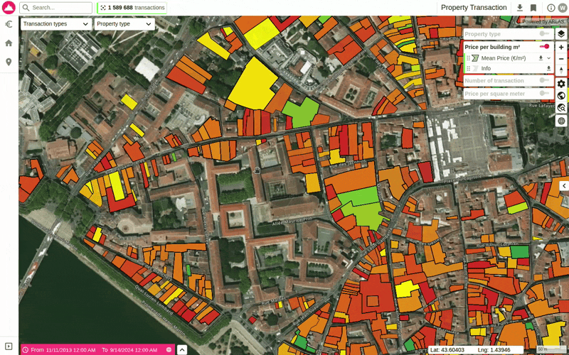
You can access the demo with this data here.
wanted to see how these values change over time, you can now clearly visualise which geometries (affected buildings) on the map are linked to a specific period on the timeline. This feature basically simplifies the visualisation of dense datasets.
You can access the demo with this data here. France public data on property transactions spanning 10 years, between November 2013 and September 2024.
In the image above, as you hover over a time segment on the timeline, ARLAS instantly highlights the corresponding geometries on the map, gently fading out others. This intuitive visual feedback empowers users to quickly pinpoint temporal patterns and sharpen their focus on the most relevant data for their analysis.
Visualisation of Missing Data in Time Series Widgets
ARLAS now clearly shows gaps in time series data with dotted lines, helping users quickly identify missing information and make more accurate decisions.
Time series data, recorded over specific periods, frequently contains gaps from missing or incomplete measurements. Previously, these gaps were not immediately visible and you'd only discover them by actively selecting a period with no records. This may lead to misinterpretations and confusion regarding data continuity and reliability for non-experts.
Now, we have updated the time series widgets to display missing data periods as dotted lines. This visual cue makes it immediately clear where data is unavailable, helping users make more informed decisions and avoid drawing incorrect conclusions from incomplete datasets.

You can access the demo with this data here. Open AQ’s data on air pollution gathered from in-situ instruments.
Hub View edit option for collection display name
ARLAS now allows users to create custom, user-friendly display names for data collections in ARLAS-Hub and dashboards, making technical data easier to understand and brand.
You can set a “Display Name” for collections, turning technical IDs (e.g., “demo_sea_phys_bcg”) into clear labels (e.g., “Marine Measures”) for better dashboard presentation.
Now, you can brand your data collections with names that resonate with your project, team, and users. This is particularly valuable when your dataset powers multiple collections tailored for diverse users or use-cases

You can access the demo with this data here. A collection of three datasets showcasing how you can explore multiple datasets on the same dashboard.
Discover your collections organised on a brand-new, dedicated page within ARLAS Hub, as illustrated below.

“Globe” view
Is our world flat? I guess the response depends on who you ask. At Gisaia, we are in the “round Earth” corner.
We believe in seeing the world as it is—round, dynamic, and true to scale. While flat map projections have long been the default for geospatial analytics (and yes, they do work well at local scales), they come with a catch: distortions. Distances stretch. Shapes warp. And global patterns? They lose their meaning the moment you zoom out.
What if you didn’t have to choose between accuracy and usability?
With ARLAS Version 27, your map doesn’t just stop at 2D. As you zoom out, it seamlessly transforms into a 3D globe, giving you an intuitive, distortion-free view of your data—whether you’re analyzing regional trends or planet-scale datasets. Because when your insights span continents (or oceans), perspective matters.
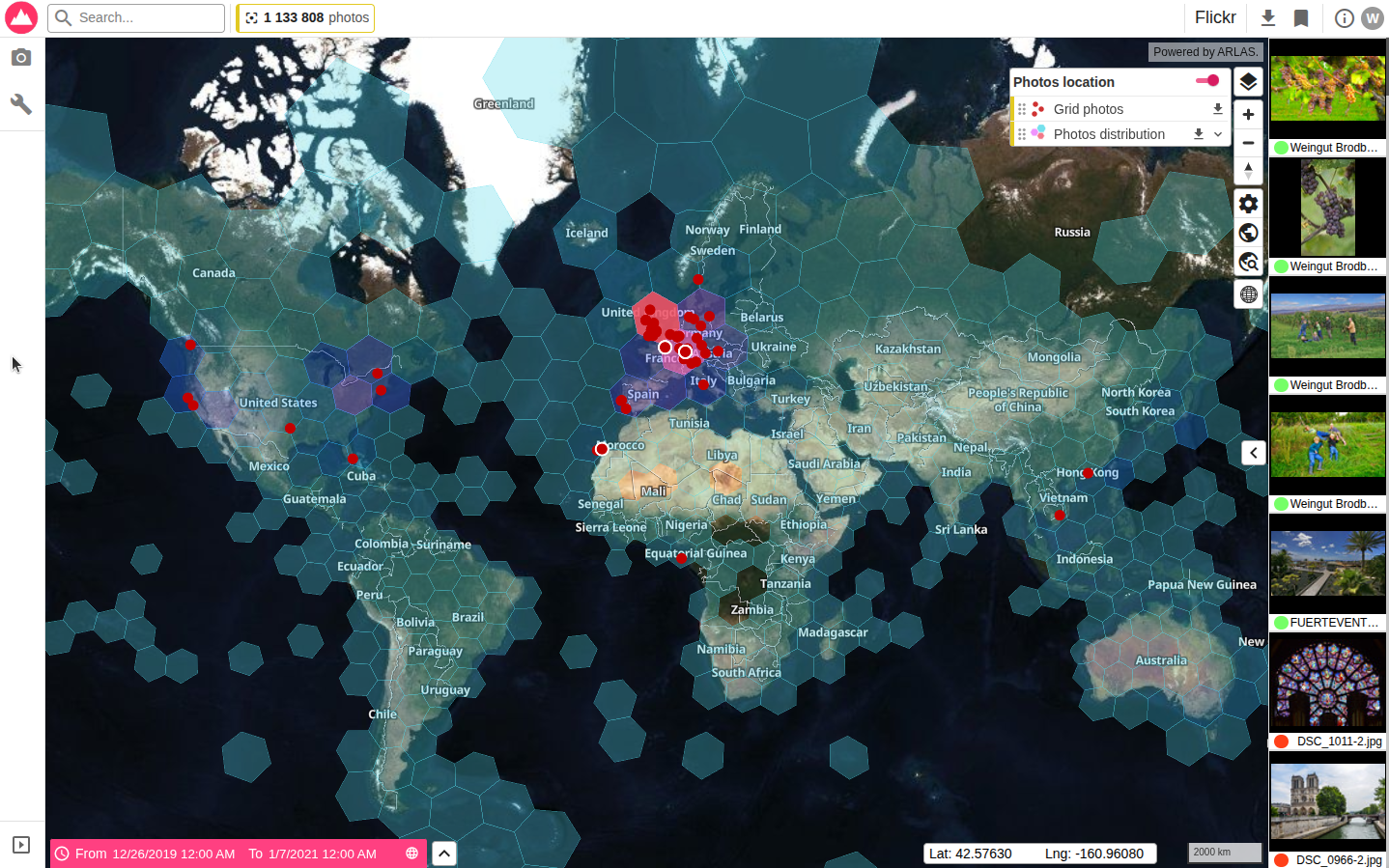

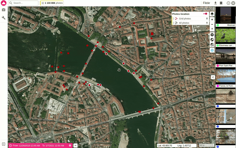
You can access the demo with this data here. A cool visualisation of Flicker images captured all over the globe.
New color palettes for interpolation
Color palettes in maps help instantly highlight trends, densities, or data categories, making it easier to interpret complex information through clear and intuitive visual contrasts.
Now, our expanded library of predefined color palettes offers a vastly wider range of options that include sequential, diverging, categorical, and qualitative schemes. These richer new predefined choices empower users to quickly create more intuitive, accessible, and visually stunning maps, precisely tailored to their data and audience communication standards

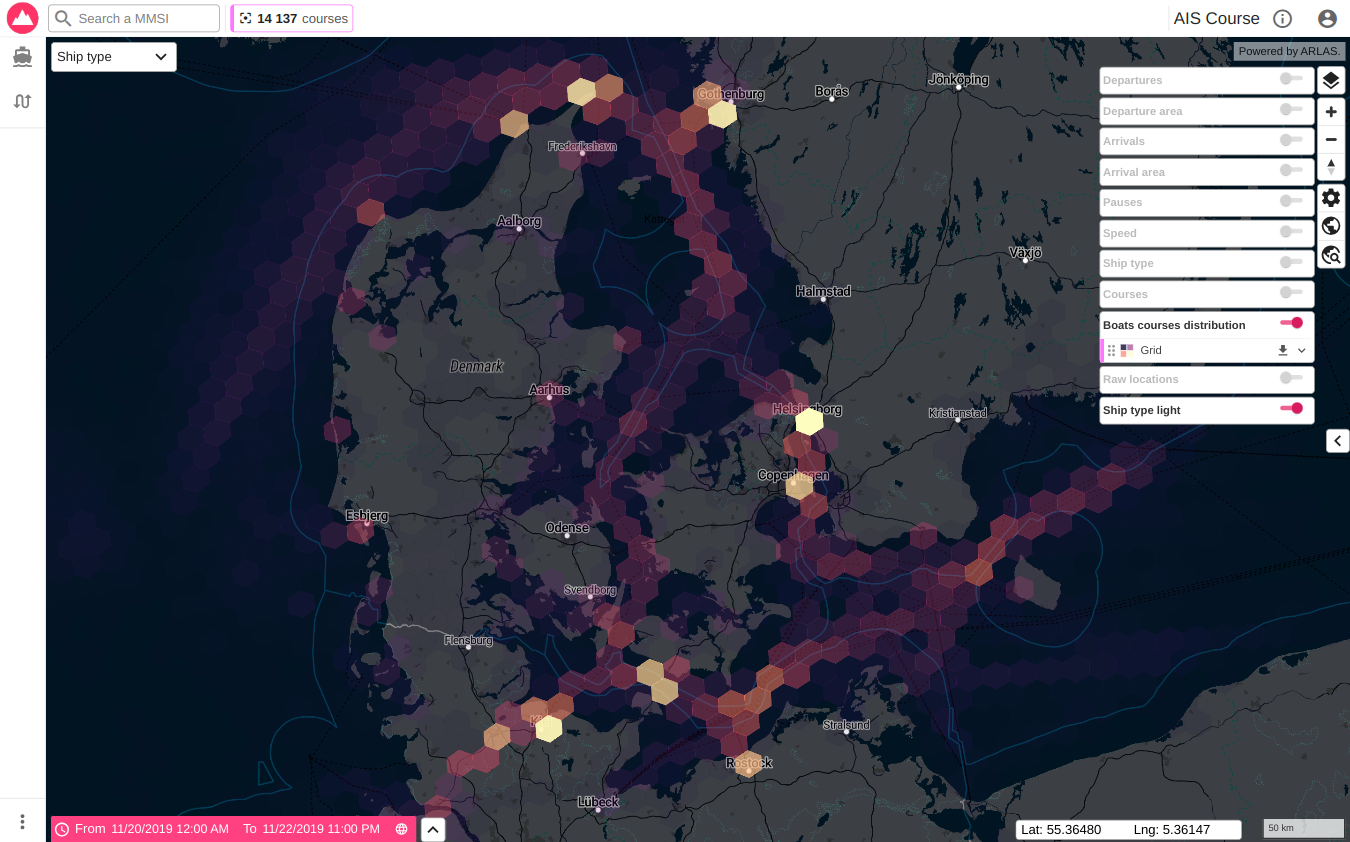
You can access the demo with this image here. Featuring Denmark’s open AIS data capturing vessel displacements in their waters. Our Data science team applied algorithms to this data to extrapolate “vessel courses.”
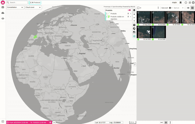
COG Viewer with T-tiler
ARLAS now directly supports the visualisation of Cloud Optimised GeoTIFFs (COGs) using titiler, allowing for seamless display of high-resolution raster data like satellite imagery without prior processing.
Cloud Optimised GeoTIFFs (COGs) are the standard for efficiently storing and serving large geospatial raster datasets. Now, not only do you have the COGs globally available, ARLAS v27 lets you configure and document different visualisations for COGs, for instance, NDVI visualisation.
This powerful new capability ensures seamless rendering of high-resolution raster layers such as satellite imagery or elevation models, with dynamic zooming and panning for incredibly efficient exploration.
See the image below demonstrating how it works. This feature is applicable to sentinel 2 products and any other products that have COG.
CORE FUNCTIONALITY UPDATES
Update Angular from v14 to v18
While 'cool' features capture attention, a stable and robust core is critical for any solution. As our front-end evolves, so does our back-end.
If you have checked out our documentation, you know that Angular is one of the key components of ARLAS. ARLAS version 27 sports Angular v18, up from version 14.
This brings substantial benefits, including the latest performance improvements, critical security patches, and modern development features. Version 14 became outdated, restricting access to new tools and potentially exposing ARLAS to vulnerabilities
We've meticulously migrated our entire codebase from Angular 14 to Angular 18. This comprehensive update delivers optimisations for faster rendering, enhanced compatibility with recent libraries, and access to powerful new Angular features such as improved reactivity and hydration support
Switch from mapbox to maplibre
Our development is firmly rooted in the open-source philosophy. ARLAS is proudly open-source and OGC compliant, a commitment vital for complete transparency and user autonomy.
To minimise reliance on proprietary solutions and achieve greater flexibility in customising the mapping experience, we've transitioned to MapLibre. MapLibre is an open-source, fully compatible alternative to Mapbox GL JS (which was previously open source), allowing us to maintain robust functionality while perfectly aligning with our long-term vision of embracing open technologies.
Existing ARLAS users, rest assured! All your familiar map features have been preserved. We achieved this seamless transition by replacing Mapbox with MapLibre GL JS, taking the opportunity to further optimise performance and reduce external dependencies.
Sneak Peek: ARLAS Version 28 is on the Horizon!
ARLAS Version 28 is just a few weeks away! Building on the globe view, this exciting update will further integrate sophisticated 3D data representation. Stay tuned!
Whether providing vital context for a point of interest or enabling powerful comparisons across diverse data collections, ARLAS's core mission remains: to dismantle technical barriers and unlock effortless access to invaluable insights from geospatial big data.
Get Started
ARLAS Version 27 is far more than just a tool – it's your gateway to effortlessly exploring, analysing, and visualising geolocated images and data. Designed for GIS experts, data scientists, and decision-makers, it empowers you to make smarter, faster, more informed decisions.
Dive into the comprehensive ARLAS Version 27 documentation, available now on ourwebsite andGithub. Experience the possibilities firsthand by exploring our live demos. When you're ready to begin, ourtutorials will guide you, and we'd love to hear how you're using ARLAS! For swift and easy onboarding, our support services are here to help. Contact us today.