Mapping the evolution of the Covid19 epidemic

We are facing a long challenge and, although there is not much we can do about it, we must limit contact between us.We wanted to better understand the situation so we created this visualization, we thought we’d share it with you.We have sought to visualise the data collected by the Johns Hopkins University & Medicine in order to better understand the global situation. These data show us two important things:
Many countries, such as France, are just at the beginning of this crisis.
What we wanted to share with you, which should encourage and invigorate us. These are the good results achieved, among others, by China, and which we will end achieving through patience and vigilance.
This “geo-analytical” view is deliberately not anxiety-provoking , to remind us all why we are making these efforts every moment and for so long.We wish you to take advantage of this time, which we usually never have, and which is this time being imposed on us, to do the thousand little things that will make us better.
The Gisaïa Team
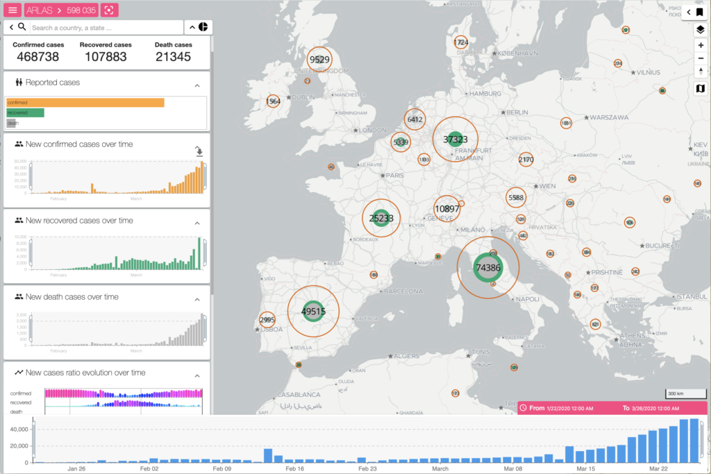
NB:You can see on the map the distribution of confirmed / cured / deceased cases according to the Johns Hopkins University & Medicine:
The number displayed in the circle is the cumulative number of confirmed cases.
The size of the orange circle represents the confirmed cases.
The area of the grey disc represents the number of deaths.
The visible area of the green ring represents the number of recoveries.
When the green ring is radically smaller than the orange circle, then there are a large number of patients. When the green ring is large and joins the orange circle, then the corresponding region can hope to move towards the end of the epidemic.The analytical views on the left allow you to filter the data to focus on a specific region or time period. You can also use the geographic toolbook on the right side of the map.Caution:
Not all cases are recorded by the Johns Hopkins University & Medicine. This is only a partial view and should be interpreted with caution.
An individual is counted once “confirmed” and then possibly counted again as “deceased” or “cured” at a later date.